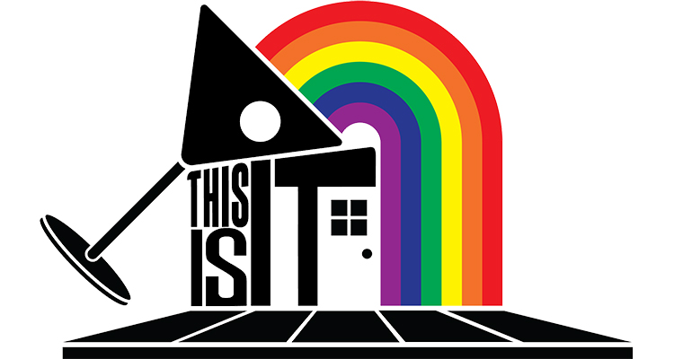
Milwaukee’s oldest gay bar, This Is It!, officially unveiled its new logo last month. The imagery, which was the result of a month-long contest, will replace the logo the Cathedral Square bar has used for decades. The half-century-old business’ decision to change its art got us thinking about other times celebrated and well-established local outfits changed their logo.
Of course, there are dozens of instances of artistic updates, full-on rebranding, and whitewashing of outdated imagery, but for literally no reason at all, here are 10 examples of Milwaukee logo redesigns that immediately come to mind.
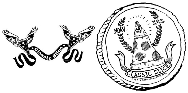
1. Classic Slice
Classic Slice didn’t really need to change anything. Its longtime logo of winged pizza slices unfurling a banner bearing the restaurant’s name was great, but the semi-recent revision is even better. Drawn by the always-great dwellephant, the Illuminati-inspired illustration perfectly fits the Milwaukee pizza purveyor that’s known for huge slices, vegan offerings, and unmatched personality.
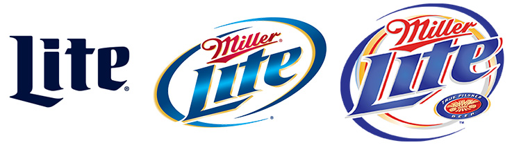
2. Miller Lite
After it was introduced in 1973, Miller Lite had the same logo until the mid-1990s, which was promptly changed in the early 2000s. Finally, the logo was changed back to its original design in 2014, thus proving that time is a flat circle and neither taste or artistic merit matter to most consumers.
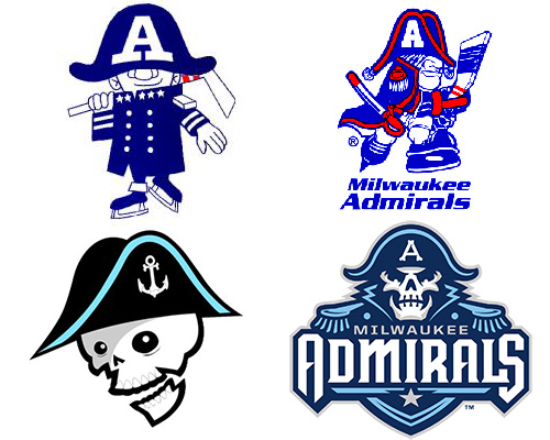
3. Milwaukee Admirals
If you look at it the right way, the evolution of the Milwaukee Admirals logo can also double as a chart tracking the transition from adolescent to adulthood to skeleton to, uh, decorated naval skeleton. It’s pretty deep stuff.
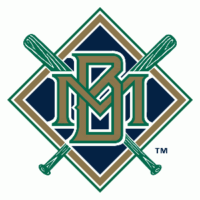 4. Milwaukee Brewers
Everyone in Milwaukee knows the Brewers like to change their logo with some regularity. From the boring M upon moving from Seattle in 1970, the team moved to the “Barrel Man.” That was followed by the beloved “ball and glove” the team used through its 1980s heyday through 1993.
In 1994, the team switched the widely-panned “diamond” logo, which is actually very awesome. That’s a proven fact. However, with a new stadium on the way and the terror of Y2K looming, the team changed to its present logo in 2000 (with a Wisconsin-shaped alternate thrown in for good measure). That said, the Brew Crew still trots out their retro designs with some regularity.
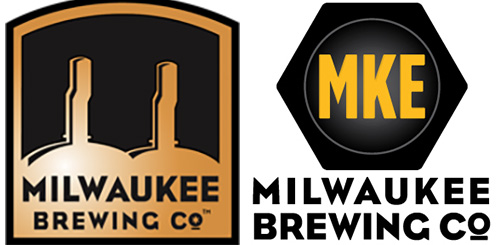
5. Milwaukee Brewing Company
If you look at the tap handles of certain bars that were early Milwaukee Brewing Company adopters, you might see the brewery’s original logo in all its plain (lack of) glory. That art didn’t last long before being replaced by the lug nut logo MKE Brewing still uses today. The font remains, nodding to the beer’s early aughts origin.
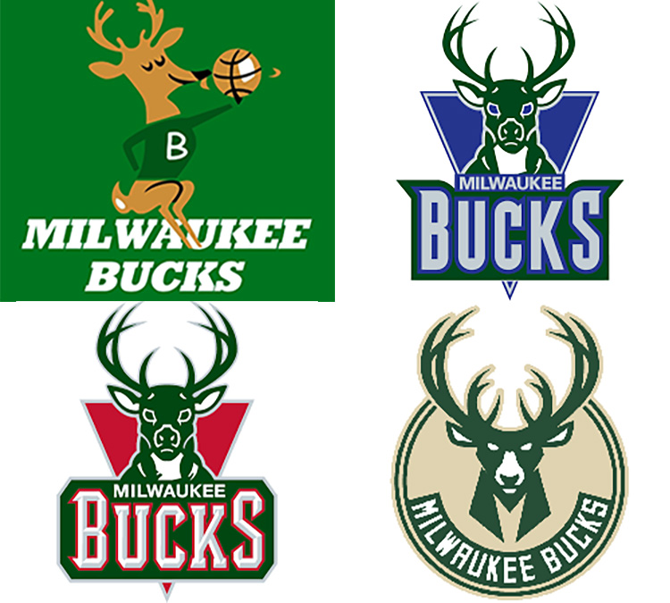
6. Milwaukee Bucks
Over the course of the long history of the Milwaukee Bucks, the team has employed four main logos that tend to tell the story of the organization. The cartoonish and sweater-wearing deer points to Milwaukee’s (comparably) prosperous past. The offsetting purple color scheme and mean-mugging buck of the ’90s and early ’00s are a reminder of regrettable roster moves and general fan apathy, followed by the similar-but-improved logo that came after that. Finally, the new color scheme and deer are signs of a commitment to change and a signal of better days not so far ahead….even if it kind of looks like the Jägermeister logo.
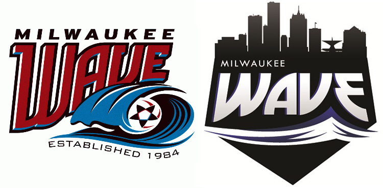
7. Milwaukee Wave
The Milwaukee Wave seems to hate normalcy. Amid routine changes in ownership, arenas, and leagues the indoor soccer franchise has sustained in its 33 years, the team has also been prone to trotting out new logos every now and then. The latest (right) is probably the best of the bunch.
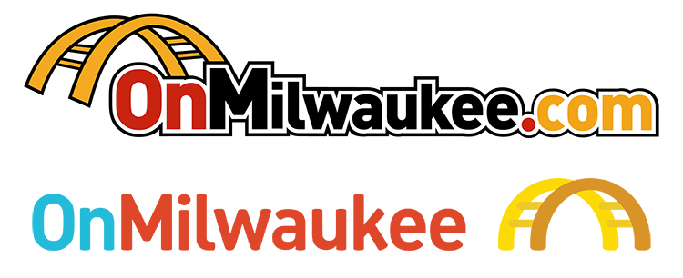
8. OnMilwaukee
At the end of 2015, OnMilwaukee surprised readers with a new logo an employee created on their own time. Though the new logo (bottom) still features the Hoan Bridge, the color scheme and lack of black border serves to soften the logo, which makes the web-only publication’s updated look pretty nifty.
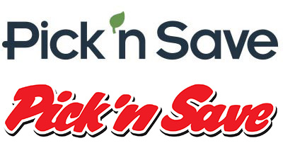
9. Pick ‘n Save
Recently, Wisconsin-based grocery corporation Pick ‘n Save replaced its tacky red and italicized logo with a simple and leafy update. Your move, Piggly Wiggly.
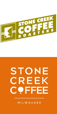
10. Stone Creek Coffee
Stone Creek used to urge customers to “sip slowly” and branded themselves with a busy olive green logo that is either a steaming cup of coffee or some repressed memory we don’t want to talk about. It was akin to one of those optical illusions that’s a candle stick from one angle and two people kissing from another. Now, the local roaster utilizes warm, clean fonts to forge branding that seems to be improving in unison with their coffee quality. Possessing a “magic eye” is no longer necessary.