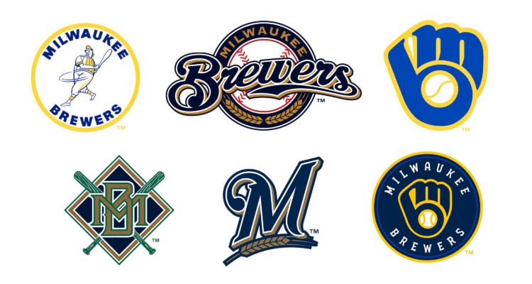
It’s Opening Day, so I’m going to rank Milwaukee Brewers logos. Why beat around the bush? Let’s just get to this shit. Dispute this if you’d like, but these are the official rankings so you’re just going to have to deal with it. PLAY BALL!!!
6. The 2000-2017 logo
Boring.
5. The 2018-2019 logo
Kind of boring, but okay.
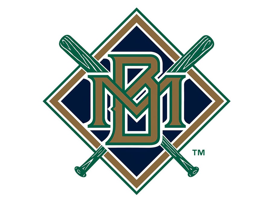
4. The 2020-present day logo
The “MB Glove” and color scheme are cool. Not really a fan of the font.
3. The 1970-1977 logo
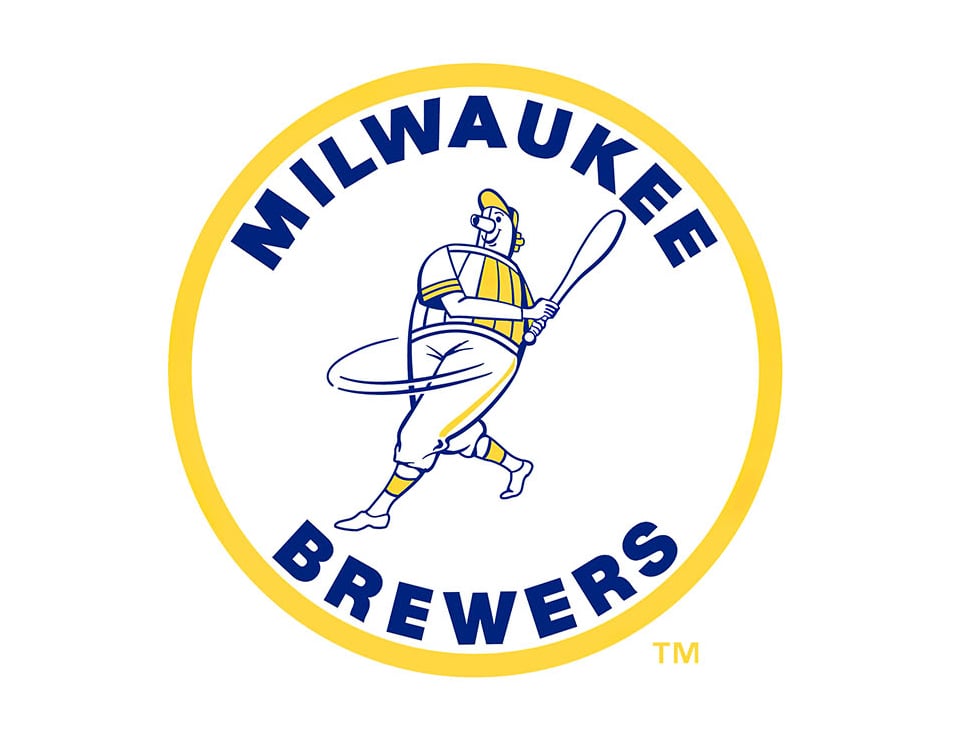
Long live Barrel Man.
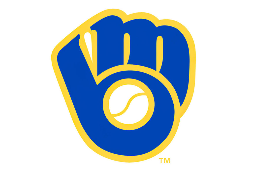
2. The 1994-1999 logo
This one absolutely rules. Only the best professional sports logo of all time could top this classic.
1. The 1978-1993 logo
The best professional sports logo of all time.